Picking Colors
How should you pick colors for your website?
Picking colors for your website
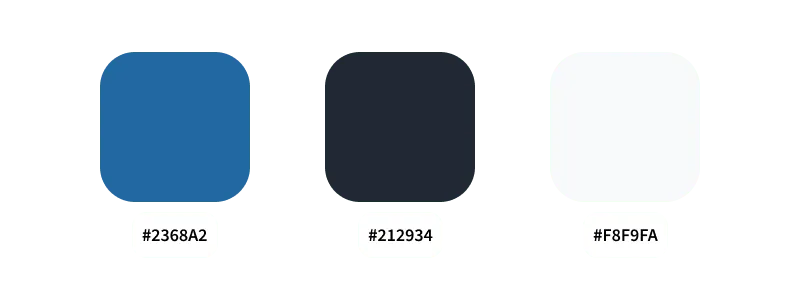
Start by selecting your main color first, this is going to be your base color. This color should be a somewhat vibrant one and not grey/white/black.
Then select your neutral colors. Select one light, near white, and one dark color, near black.
You now have 1 vibrant and 2 neutral colors.
How these three colors could look:

That’s almost all we need. Select different levels of shades for your selected colors, so color that lies in between your 3 main colors. We use these when we need more gradual steps between our colors and less strong contrasts. Like when you need a color that’s just a bit lighter or darker than another one, this is when we use these shades.
Stay simple with your colors in the beginning. It’s always possible to add more colors later.
Your color selection should be implemented as CSS variables, a description of how that would look is on the CSS Variables page.
60 / 30 / 10 Rule
A popular rule for applying colors is the 60 / 30 / 10 rule.
This rule states to use 60% of color one, 30% of color two, and 10% of color three.
Accents
In addition to your primary vibrant color you might want some other accents.
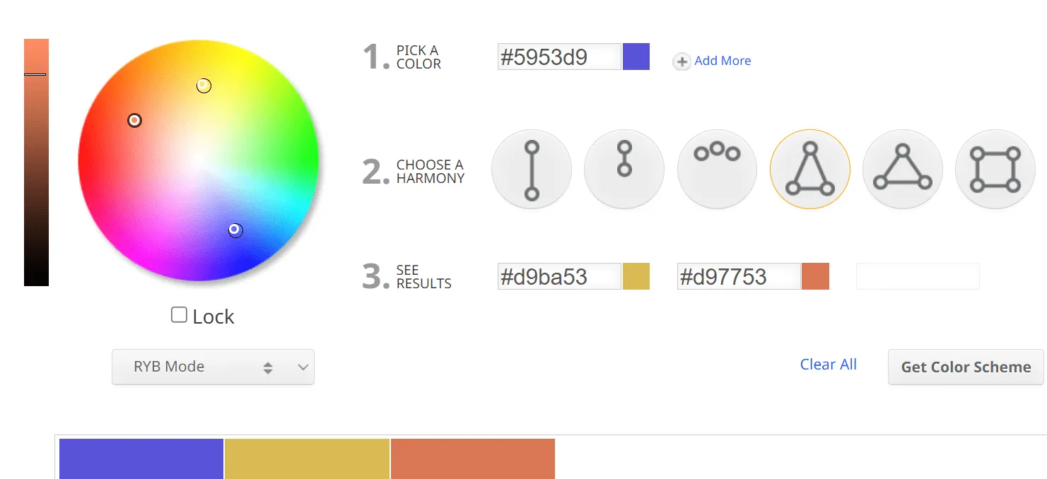
One way to find colors that compliment each other is by using color wheels. Here you can choose what kind of harmony of colors you want and then get some recommendations. I use sessions.edu and color.adobe.
Do not try to perfectly calculate your colors though, there is no reason to use the exact colors a tool like a color wheel gives you.

Another way to find complementary colors is by using palette generators. I use coolors.co and mycolor.space.
Just like for the color wheel, these can be helpful for finding general directions of color you could use when you need to select accents colors.
Building the full palette
How do you build a complete palette now?
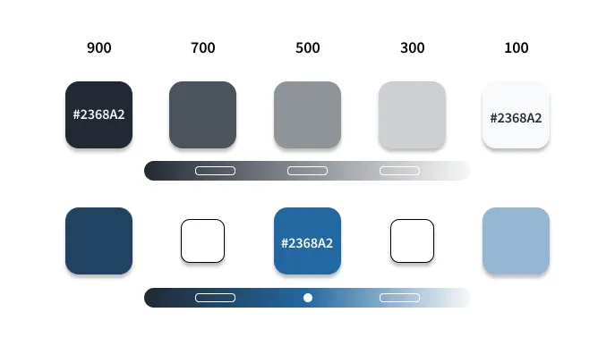
The minimum amount of colors you will want should look something like this:

Since we already have defined our base colors we now want to find the colors that lie between them.
One simple way to do is, is to just look for the color in the middle.
For our neutral colors this would be first finding 500. Do this by selecting the color that sits right in the middle of these two.
Then for 700 select the middle between 900 and 500.
You can continue this until you have all steps of 200 units, or do 100 units if you want finer control.
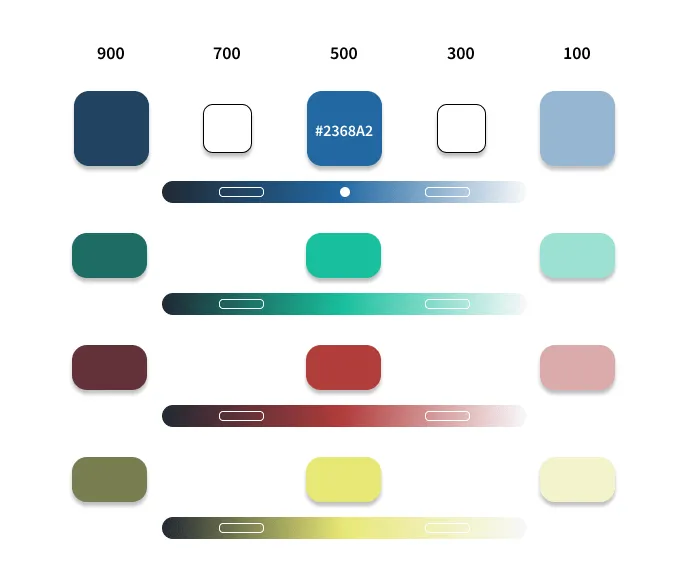
For our accent color we can do something similar. Look for the middle between the respective neutral color and the base accent color, start from there and continue like above.
How do you apply these colors?
The accent at 500 is our base accent, this one should always have the highest contrast and stand out the most.
If we now need an accent that is less strong we can now go into the respective neutral color’s direction.
In a mainly dark based design we would go into the left direction, using a higher number.
In a light based color schema we would go into the right direction, using a lower number.
By doing this we have colors that are less contrasting and stand out less.
In a website you would have a light and dark mode you can now easily swap between them. Use CSS variables to achieve that.
For example it could look like this:

Regardless if we use light or dark mode, the effect we achieve through the colors stays the same.
If we need more accents we can just repeat this process.

Accessibility
Of major importance regarding colors is accessibility. The colors you use should improve the usability of your website, not hinder it. Make sure that your elements have strong enough contrast. Be aware that your users might have totally different screens compared to you, your users might also have some visual impairment or color blindness. Regardless of these conditions, your website should work well for these groups.
Test your colors contrast ratio by using something like siegemedia’s contrast ratio tool. Aim for a score of at least 7+.
You can also check by looking at your visual design in greyscale.
Also test your website with the browsers built in lighthouse test.
Sources & References
- Color palette generators:
- Color wheels:
- Material Design’s (Google) guide on selecting colors: https://m3.material.io/styles/color/system/overview
- Guide in building color palette for a website: https://www.refactoringui.com/previews/building-your-color-palette
- W3Schools page on accessibility color contrast: https://www.w3schools.com/accessibility/accessibility_color_contrast.php
- Check contrast ratio: https://www.siegemedia.com/contrast-ratio
- How to select colors, video by Kevin Powell: https://youtu.be/mq8LYj6kRyE
- Color and contrast guidelines from the Design System of the UK government site: https://design.homeoffice.gov.uk/accessibility/colour-and-contrast